Project
The assignment asked students to create a major campaign intended to craft a new brand identity for the salon-quality Italian haircare brand, Davines.
The assignment asked students to create a major campaign intended to craft a new brand identity for the salon-quality Italian haircare brand, Davines.
Approach
The goal for this brand identity was to reflect Davines' dedication to remaining a contemporary and nature-centric brand, while highlighting its humanitarian feats in connecting to its local farms. Clinical and sterile visual language often reserved for the cosmetic and hair space were to be avoided by taking advantage of texture through materials, typography, and assisting photographic elements.
The goal for this brand identity was to reflect Davines' dedication to remaining a contemporary and nature-centric brand, while highlighting its humanitarian feats in connecting to its local farms. Clinical and sterile visual language often reserved for the cosmetic and hair space were to be avoided by taking advantage of texture through materials, typography, and assisting photographic elements.
Outcome
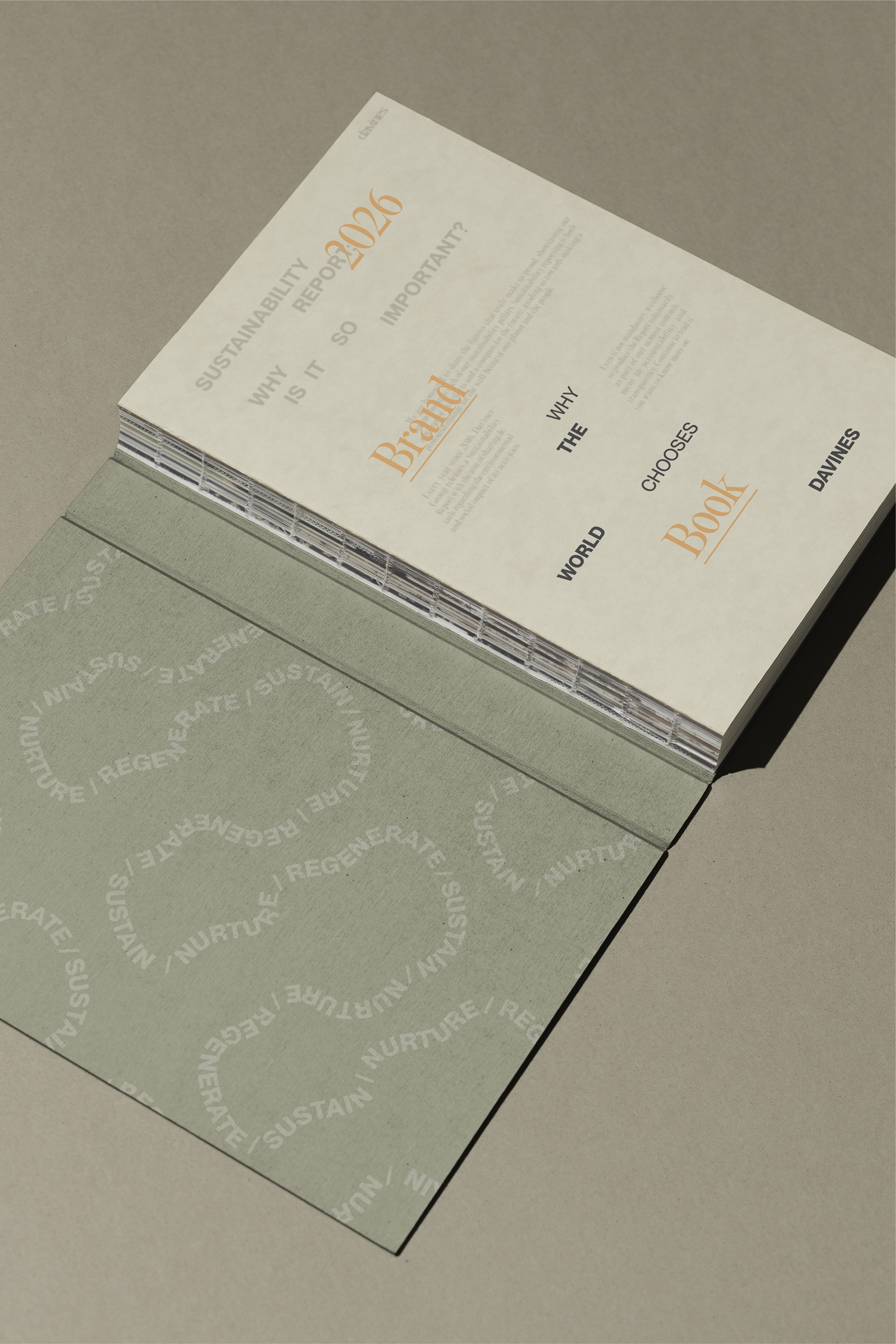
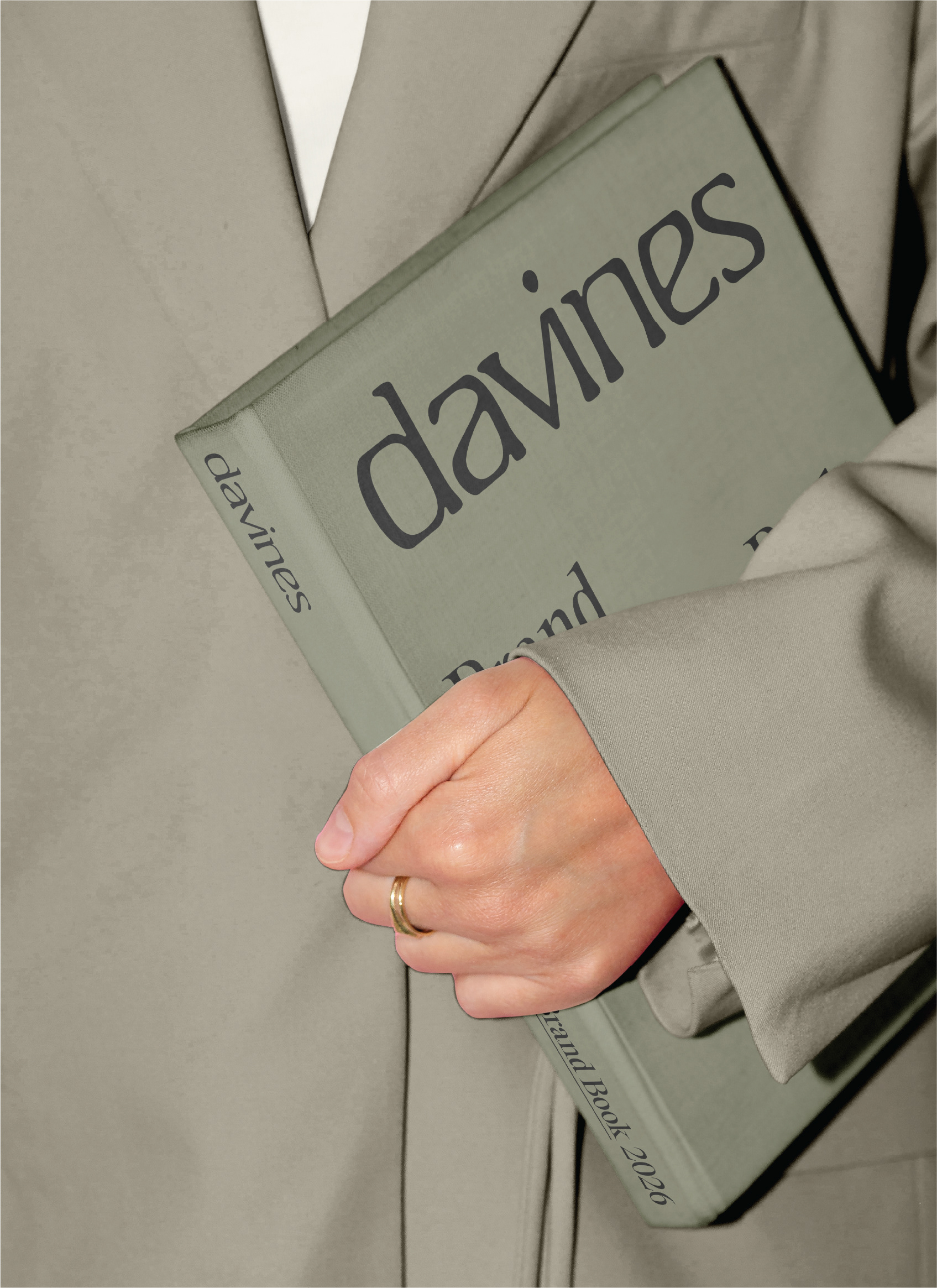
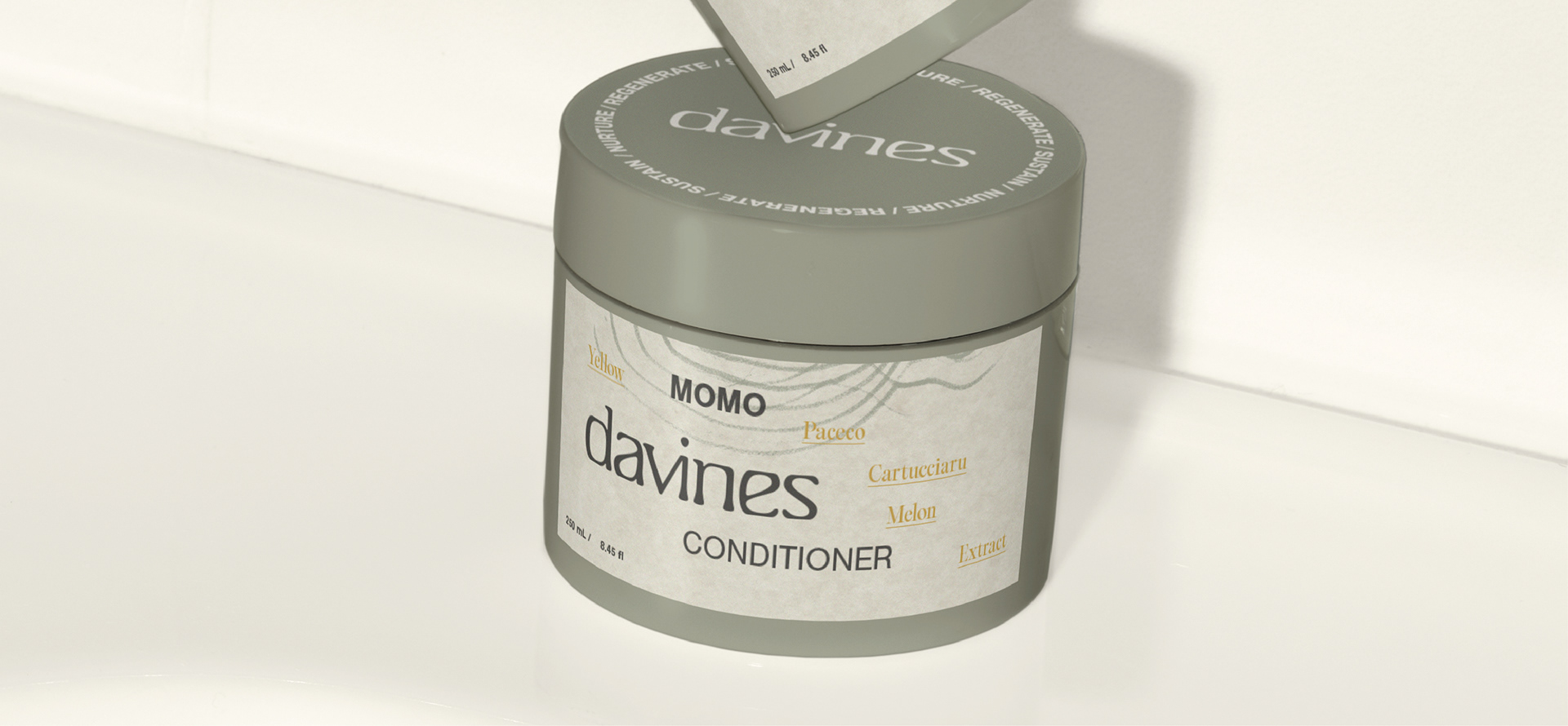
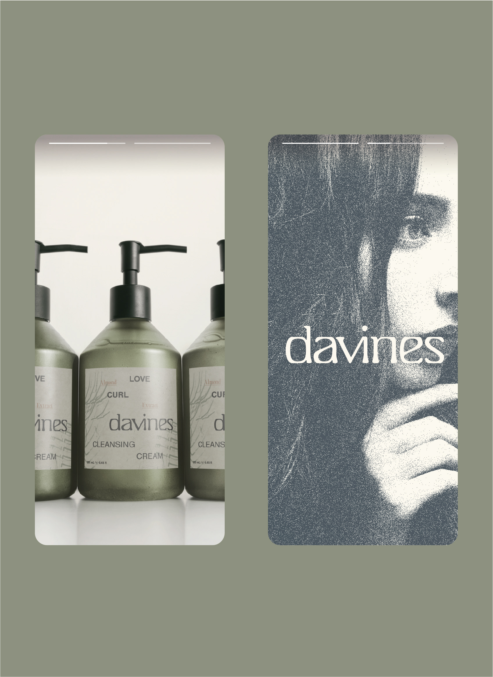
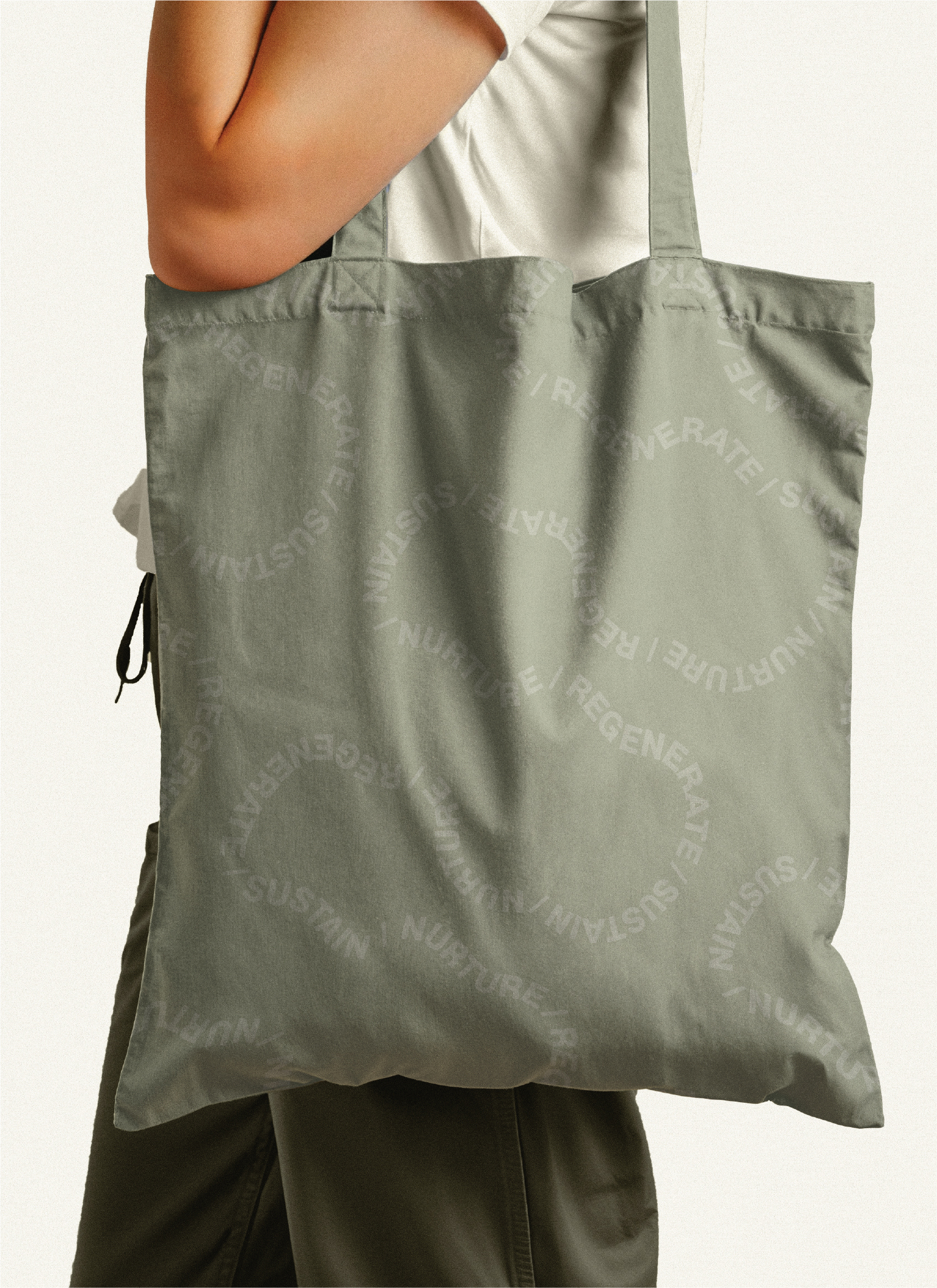
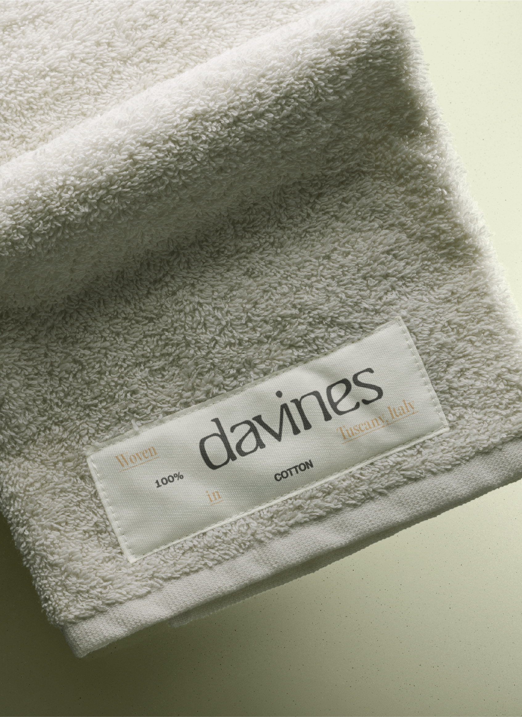
A bespoke word mark, morphing typographic swirls, grainy photography, and textural paper surfaces were developed as assets to convey Davines' core values. Additional advertising and web components vocalized Davines' work with local farms for their product ingredients. Scalable illustrations and a loose, randomized grid allow brand assets to offer a different yet rhythmic experience across branded items.
A bespoke word mark, morphing typographic swirls, grainy photography, and textural paper surfaces were developed as assets to convey Davines' core values. Additional advertising and web components vocalized Davines' work with local farms for their product ingredients. Scalable illustrations and a loose, randomized grid allow brand assets to offer a different yet rhythmic experience across branded items.
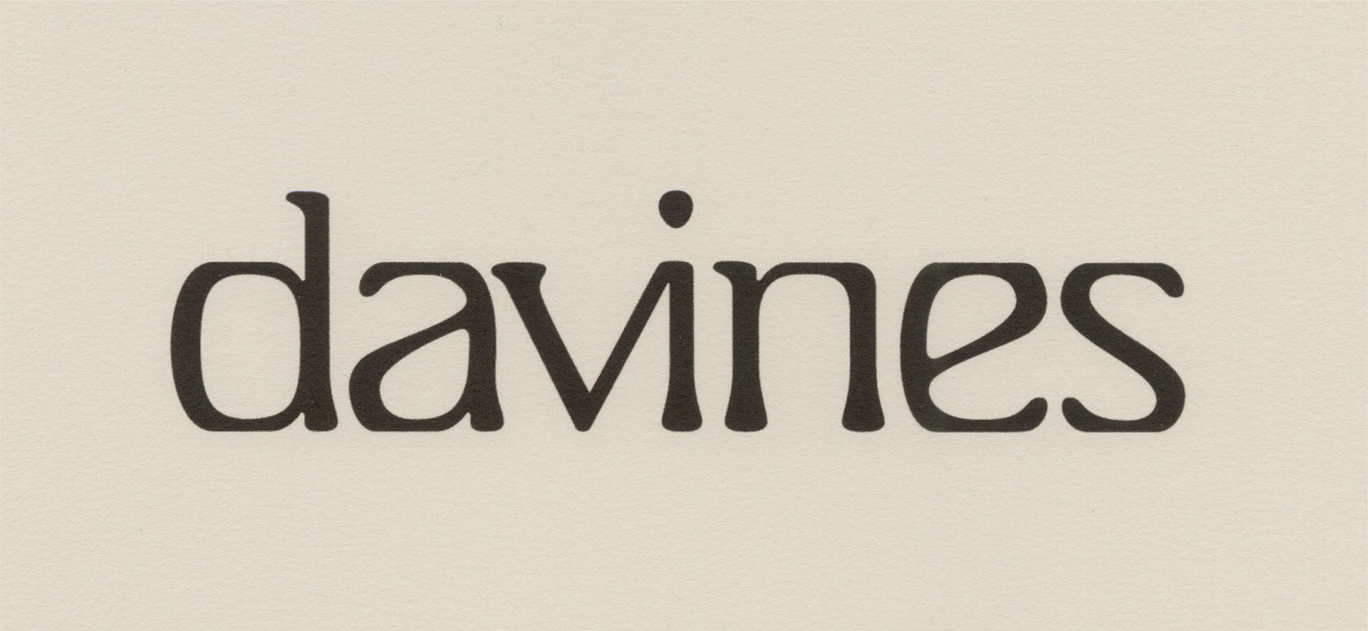
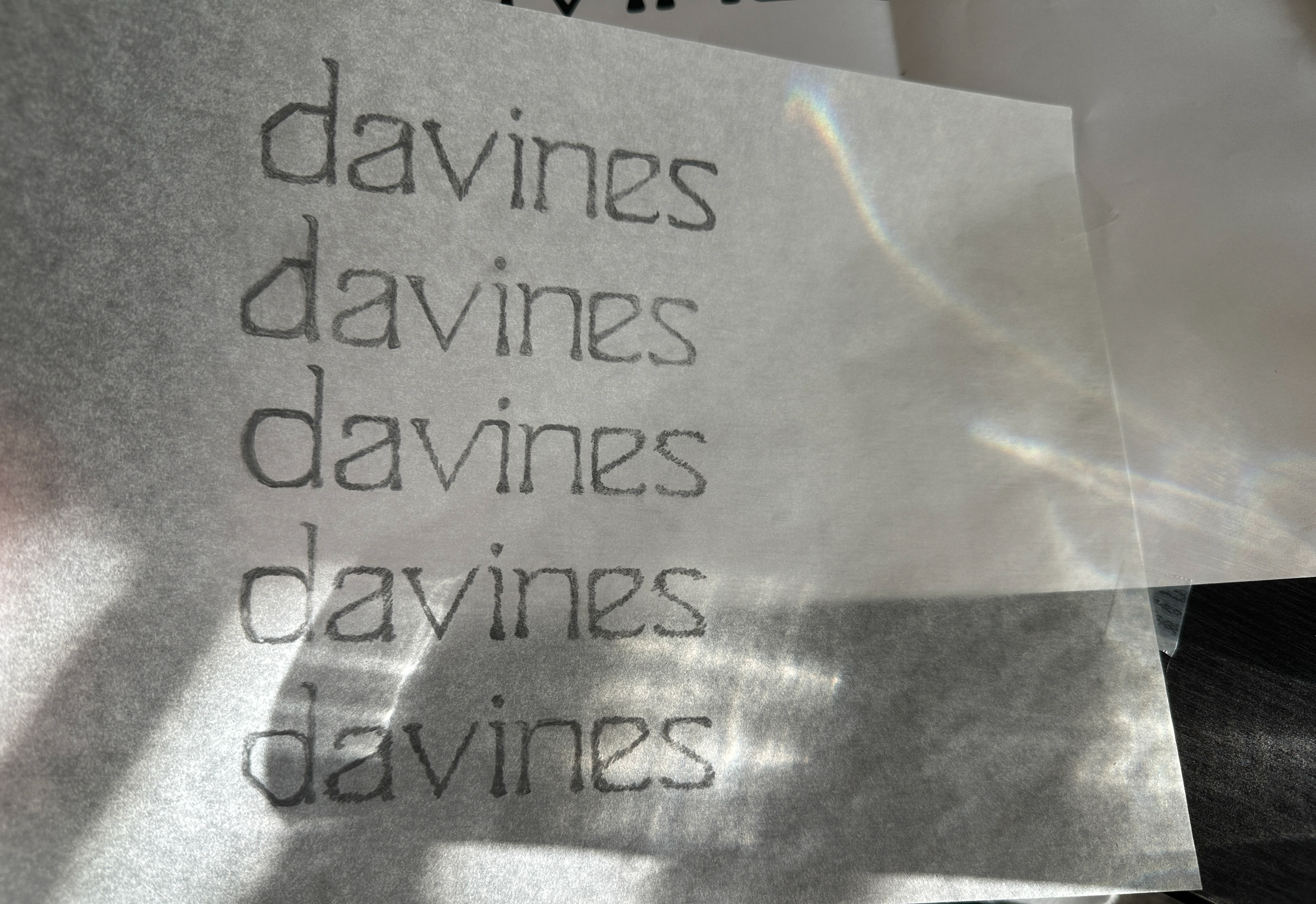
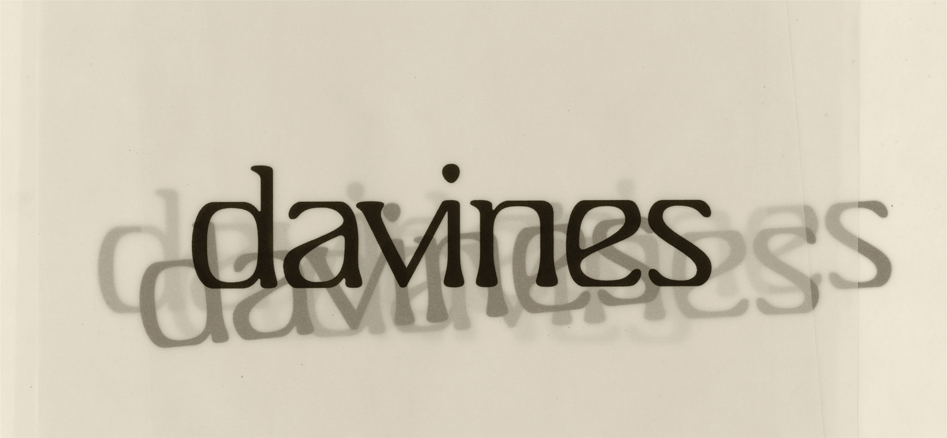
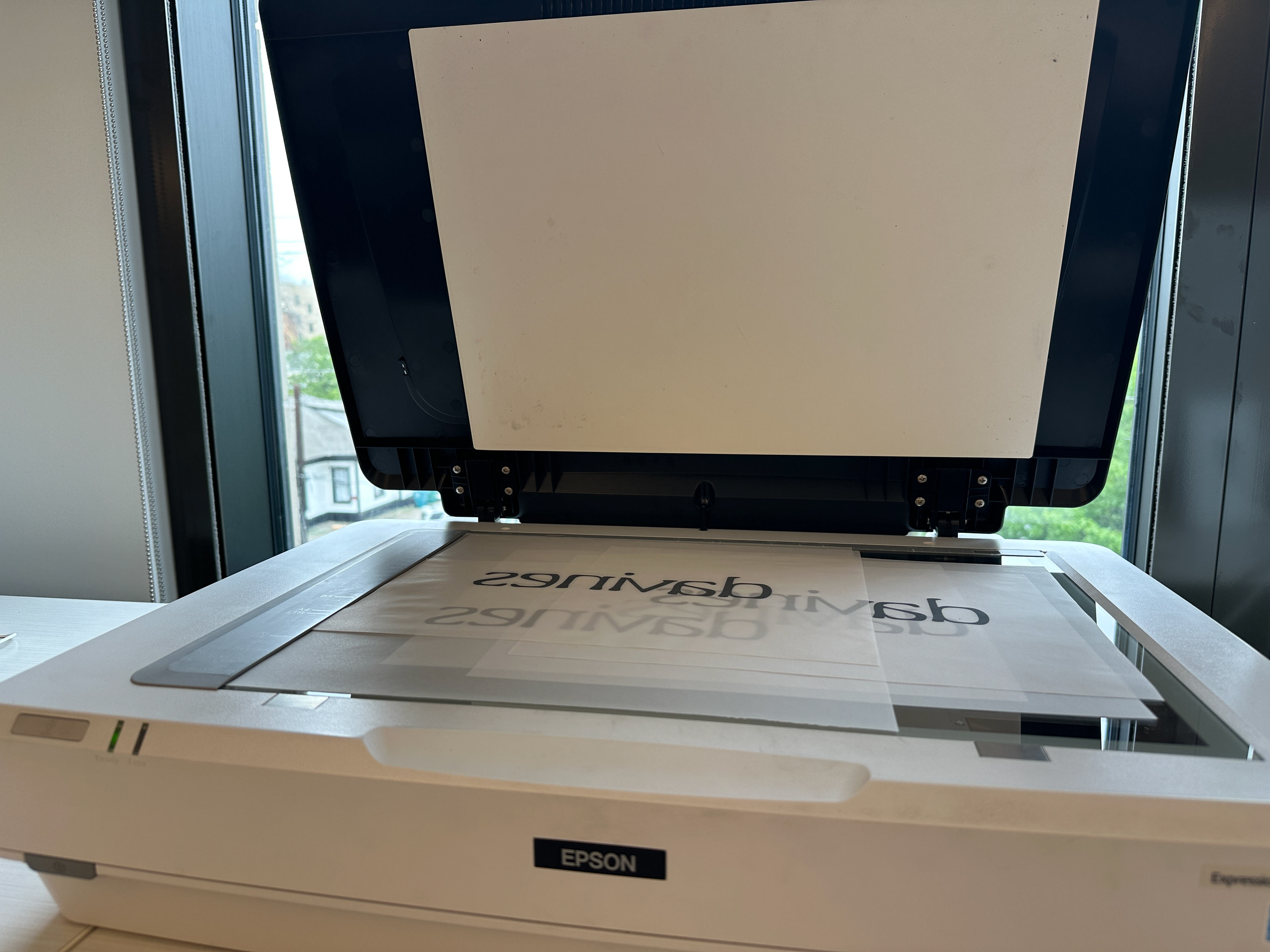
I chose to develop a custom typeface for my Davines word mark, creating enhanced brand ownership and an opportunity for furthering brand thematics through typographic design.
Using the combined anatomies of a humanist serif with a transitional sans serif reenforced Davines' positioning on the forefront of both humanitarianism & cosmetology research.
(Above)
Initial sketches during logotype ideation.
Initial sketches during logotype ideation.

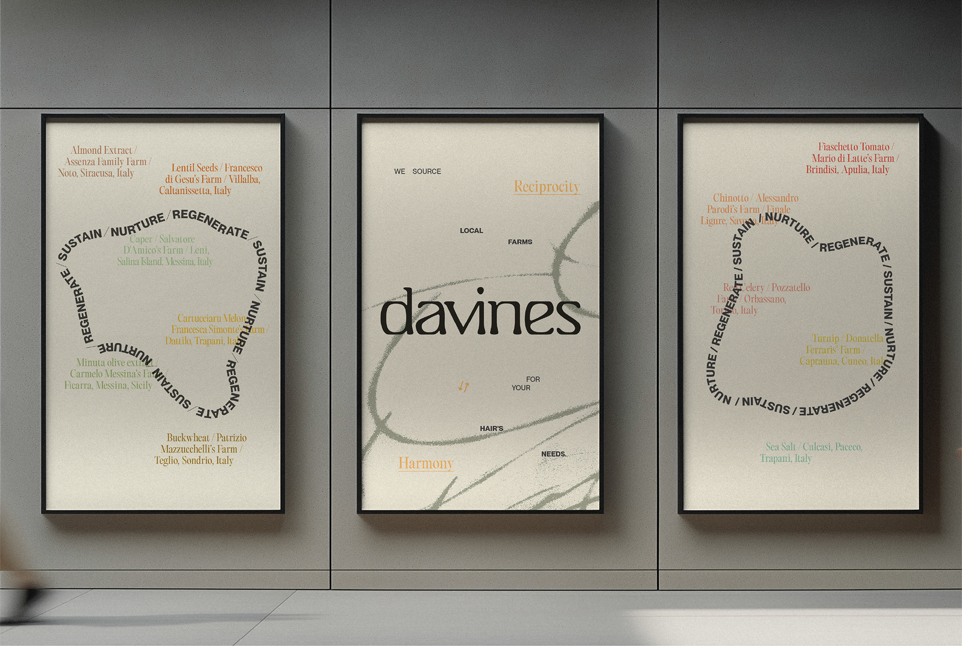
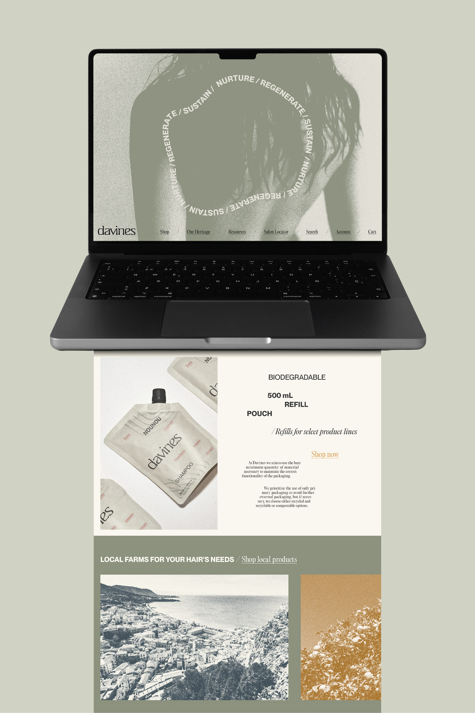
The element of transparency served the system's loose grid and textural qualities, as well as a symbol of the brand's highly transparent ingredients and ethics.