Project
One of the main requirements was that students should create a focused campaign that incorporated analog typography as the key component.
One of the main requirements was that students should create a focused campaign that incorporated analog typography as the key component.
Approach
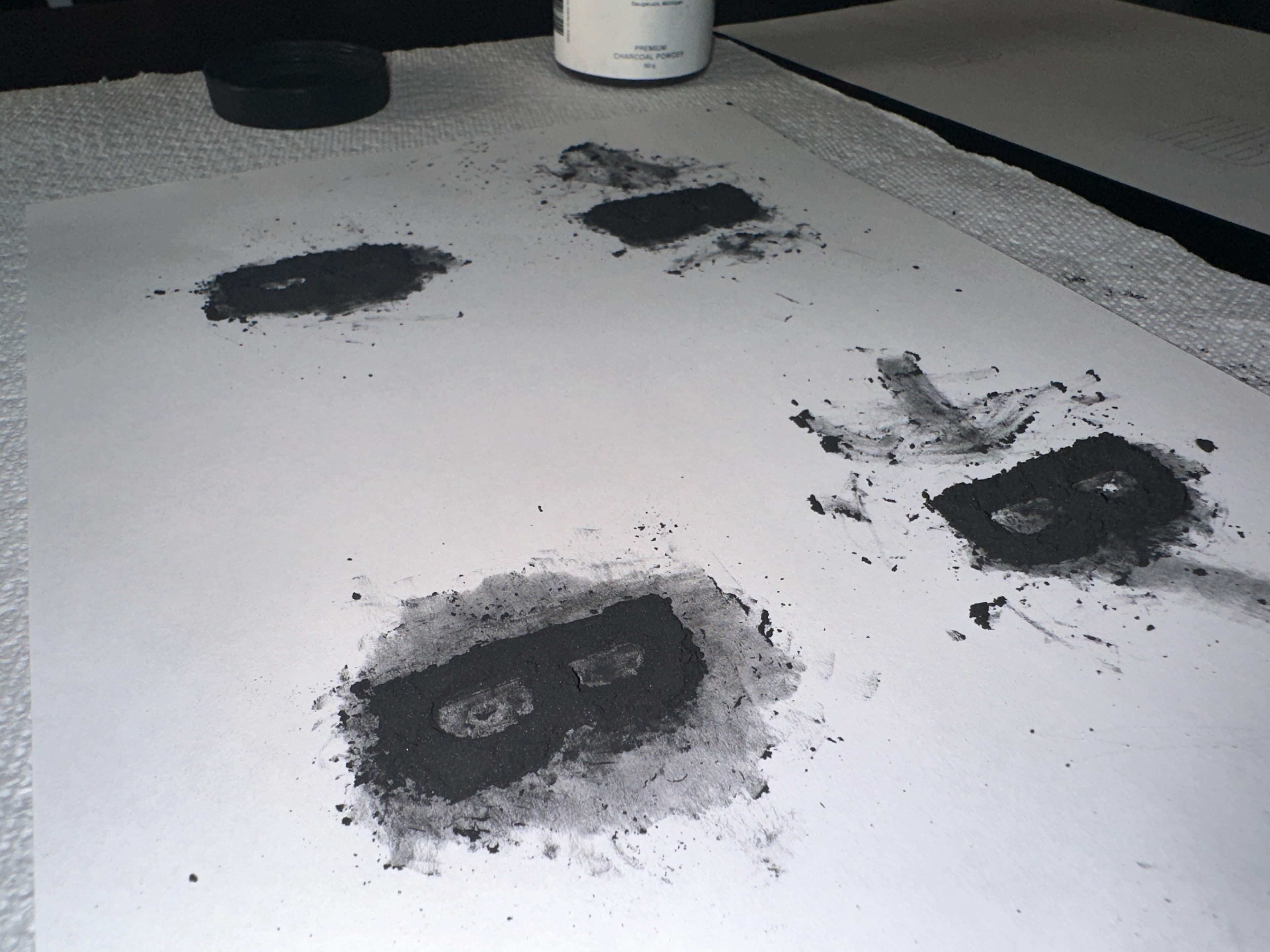
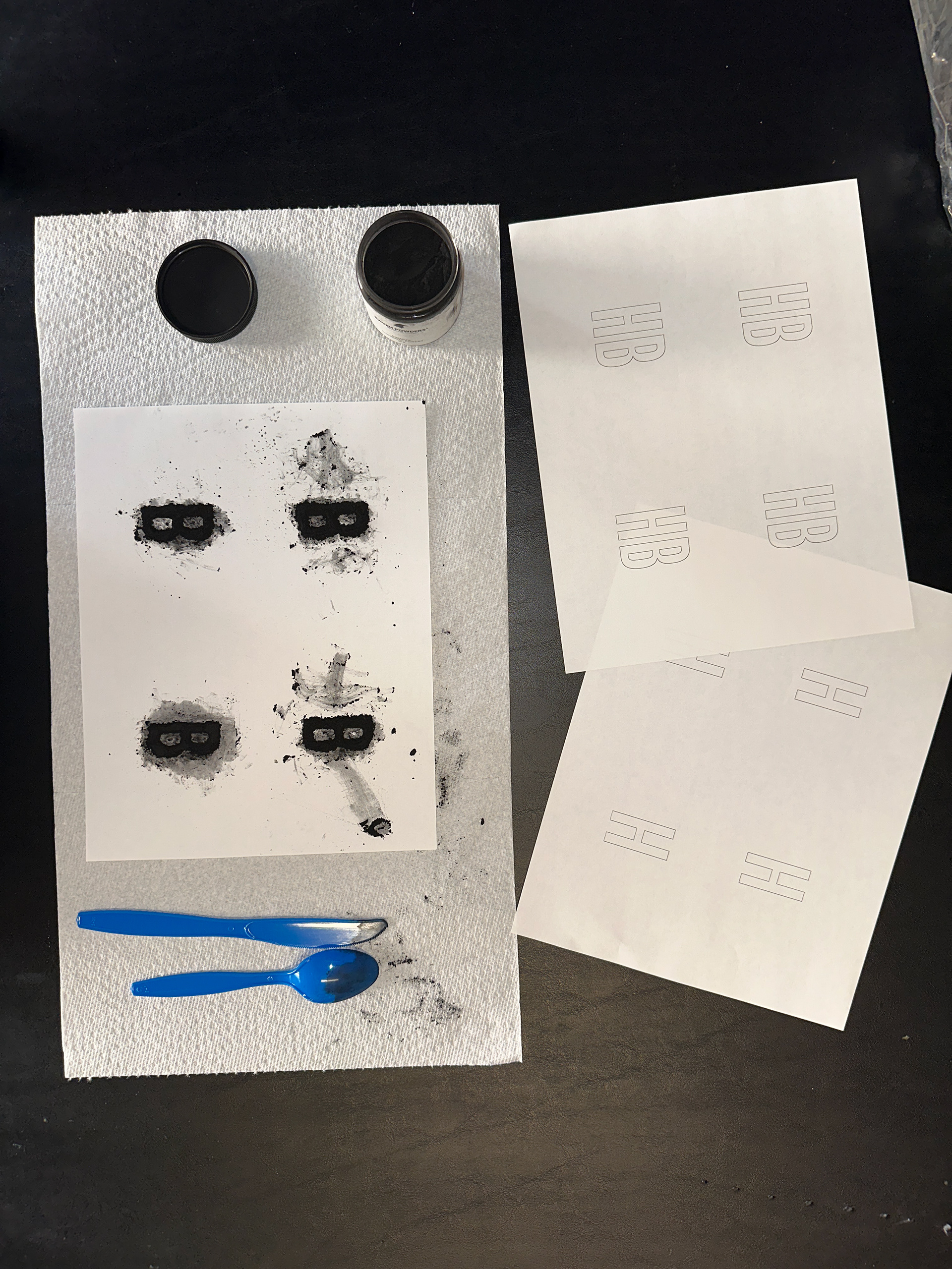
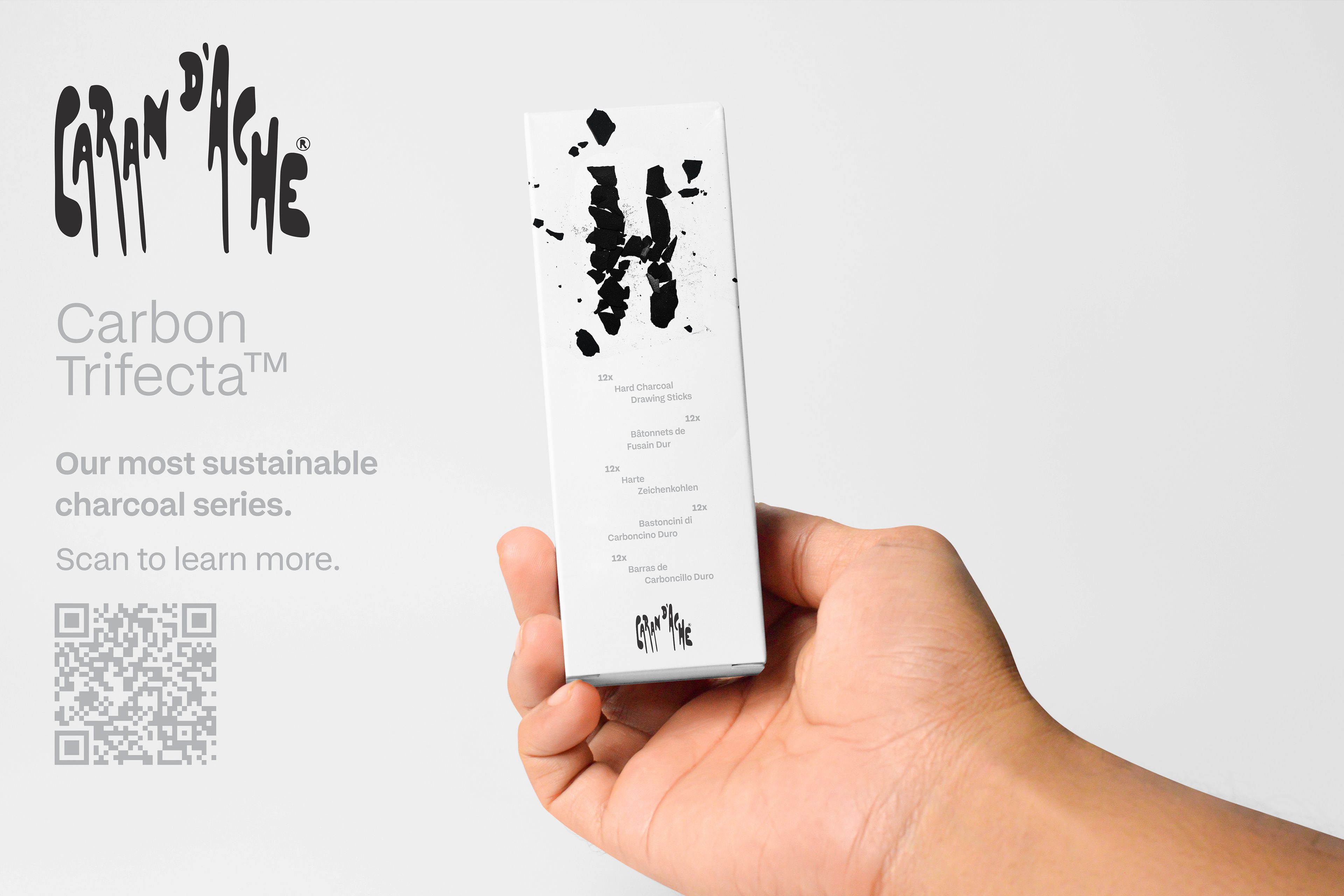
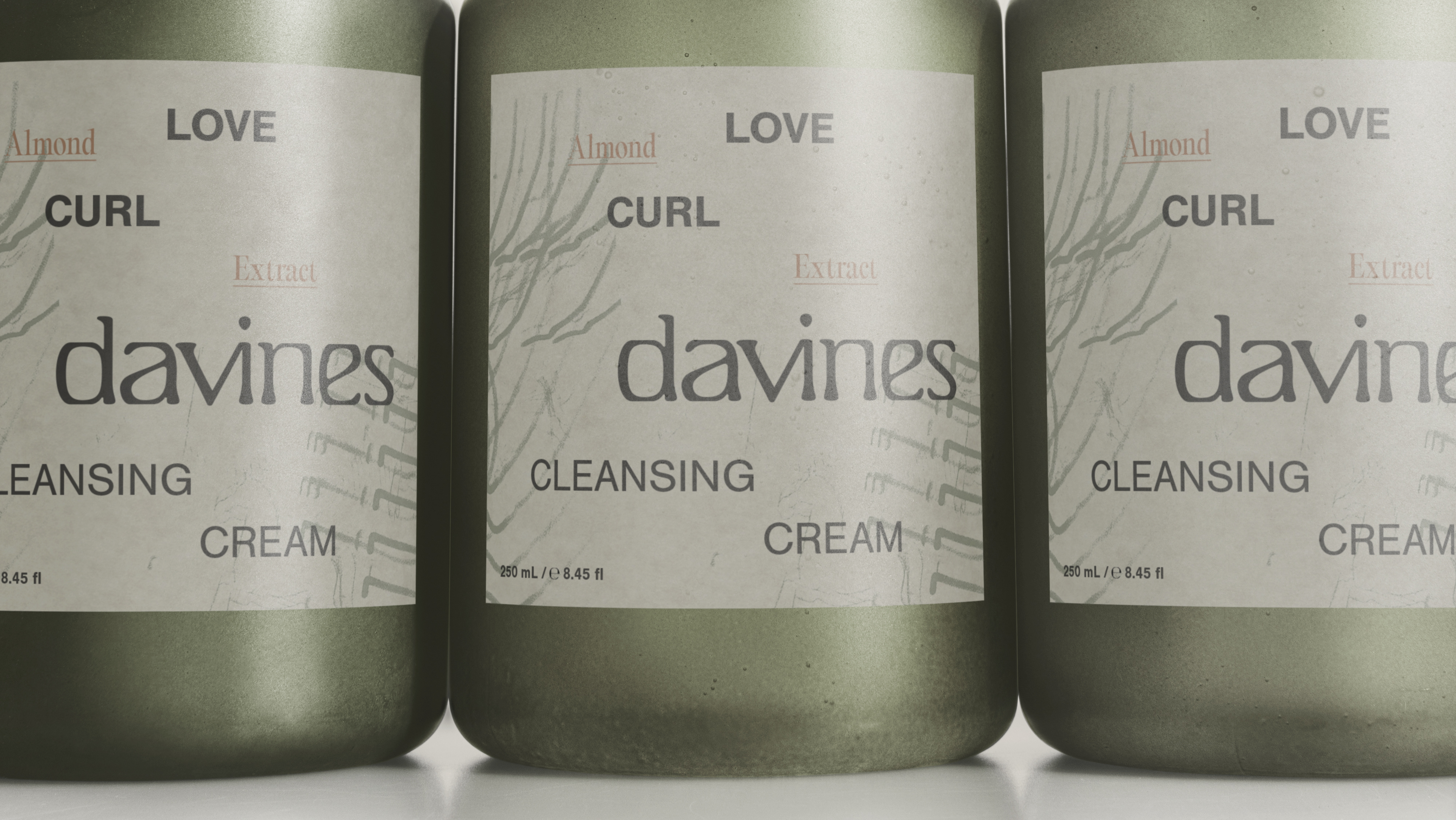
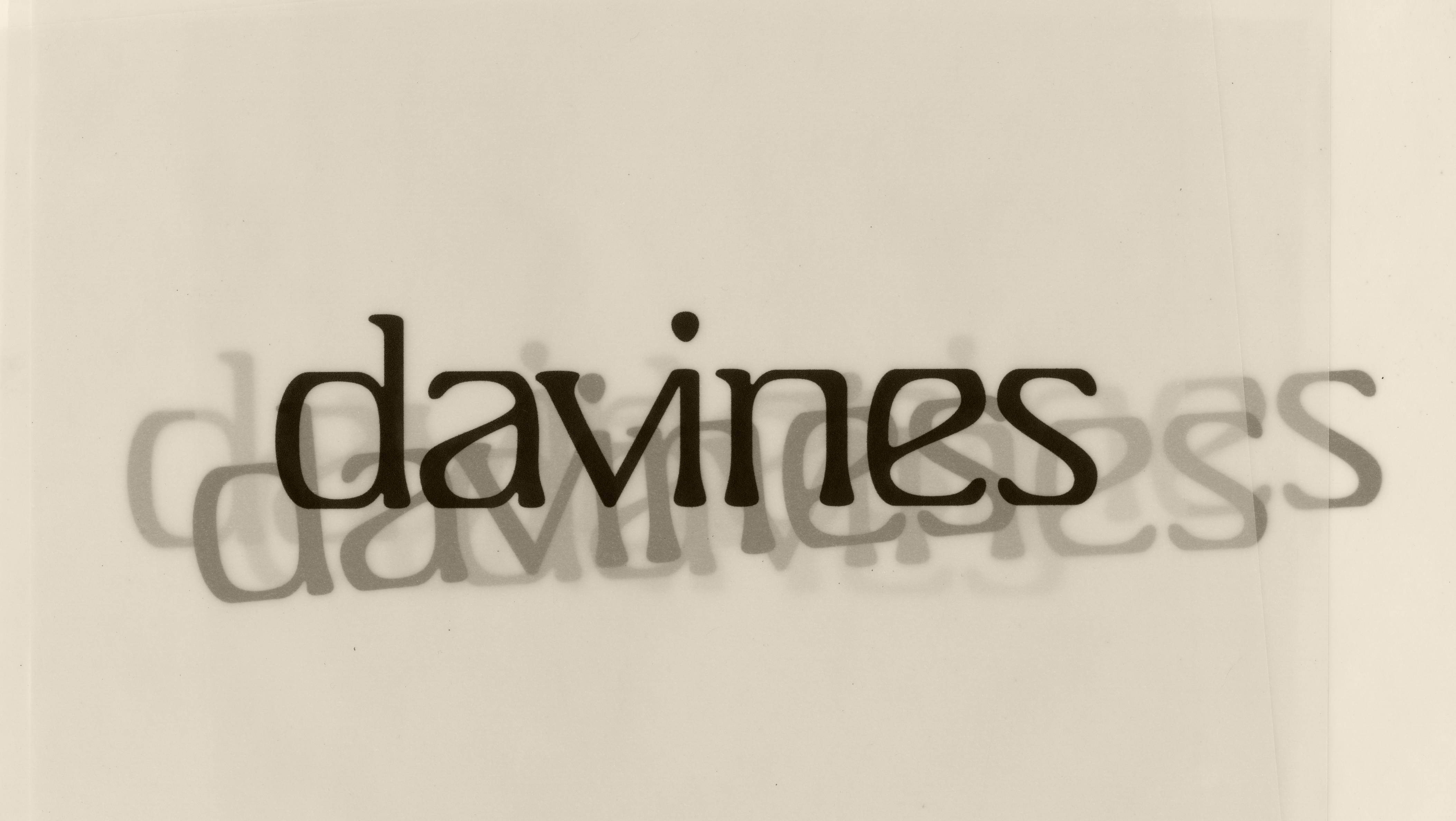
The firmness of drawing charcoal exists along a spectrum from soft (B) to medium (HB) to hard (H). Each level of firmness produces distinct visual and tactile qualities, shaping both the marks made on the substrate and the techniques that artists use to create them. The analog letter forms on the boxes were created from crushed charcoal as visual indicators, materially reflecting the texture and character of each product.
The firmness of drawing charcoal exists along a spectrum from soft (B) to medium (HB) to hard (H). Each level of firmness produces distinct visual and tactile qualities, shaping both the marks made on the substrate and the techniques that artists use to create them. The analog letter forms on the boxes were created from crushed charcoal as visual indicators, materially reflecting the texture and character of each product.
Outcome
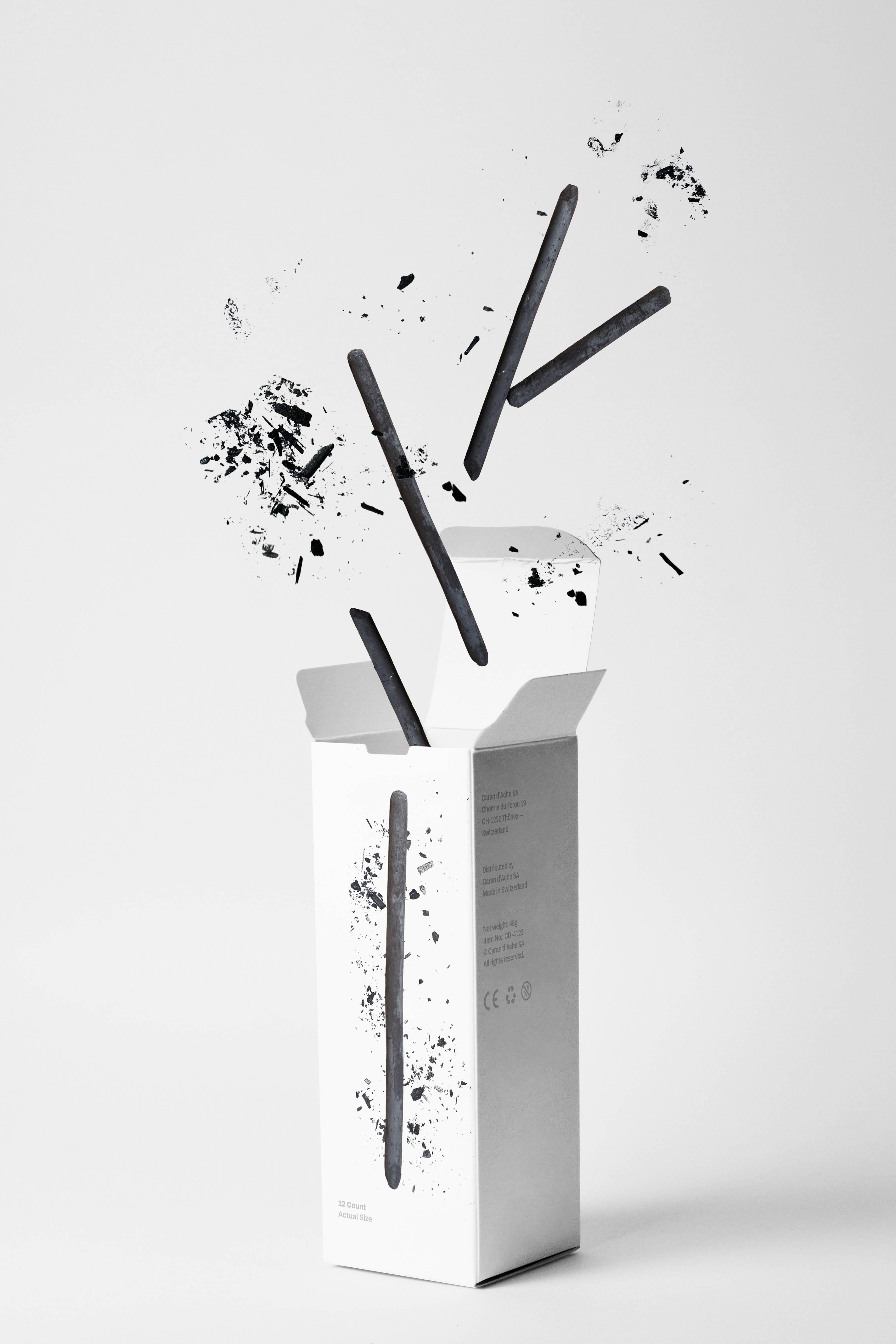
The packaging effectively communicated the visual differences between each level of firmness, while the supporting digital typography reinforced charcoal's textural themes.
The packaging effectively communicated the visual differences between each level of firmness, while the supporting digital typography reinforced charcoal's textural themes.
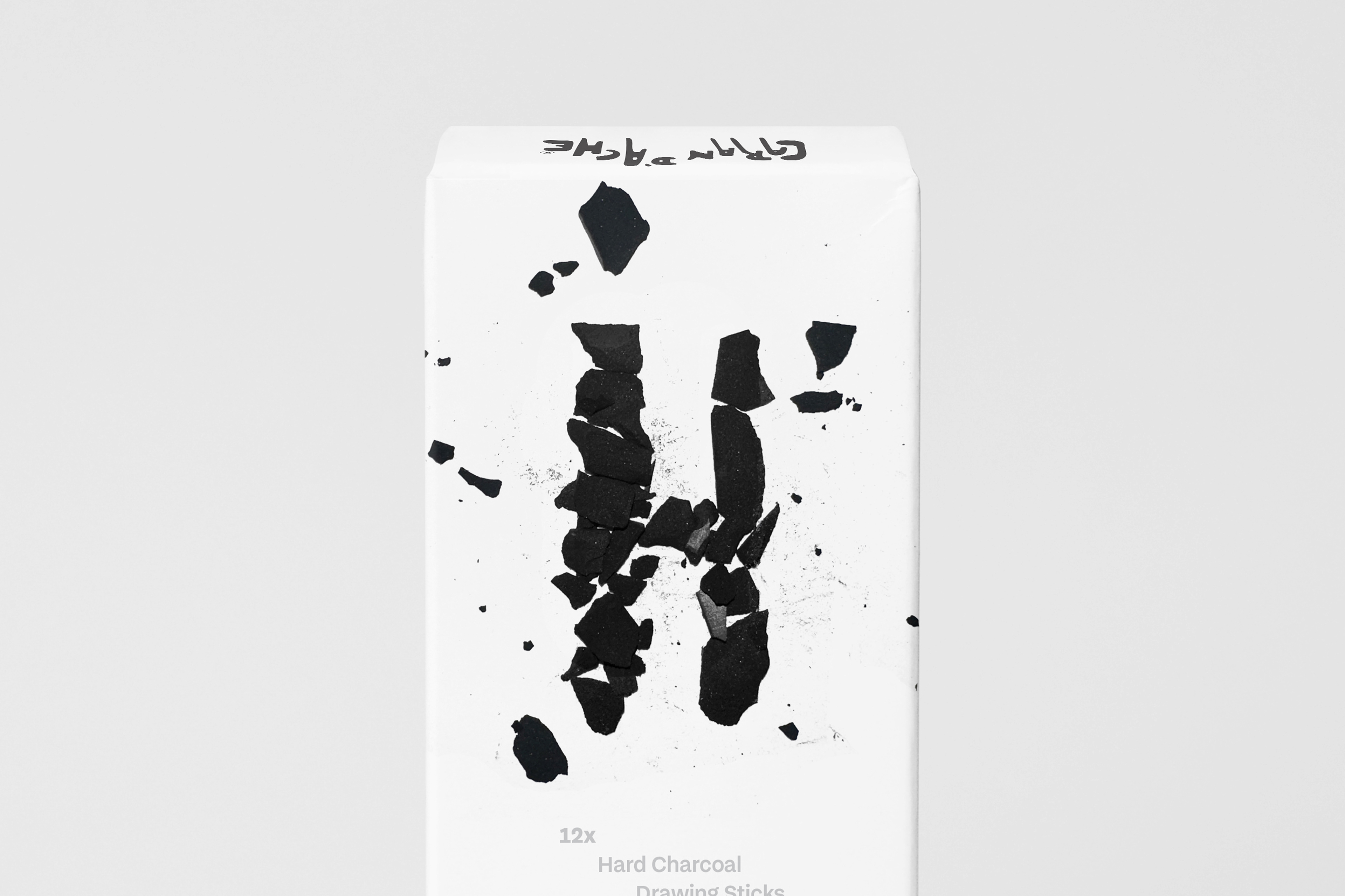
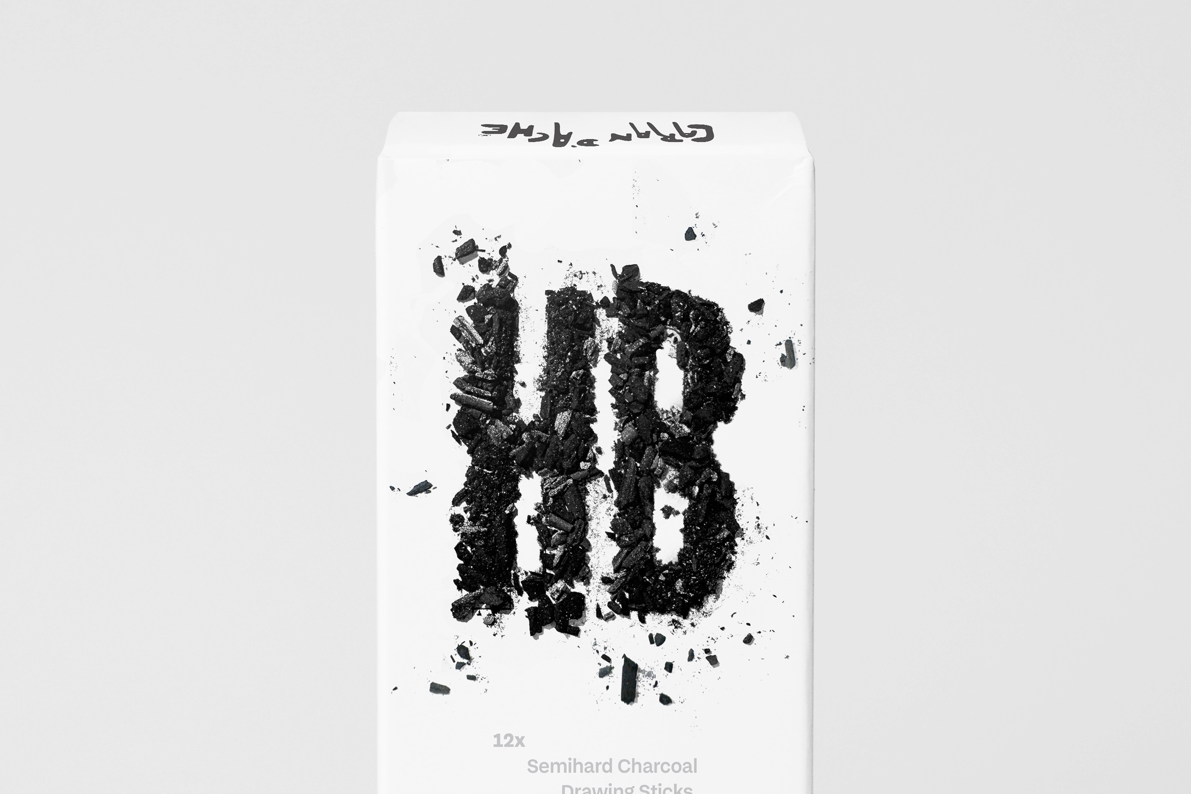
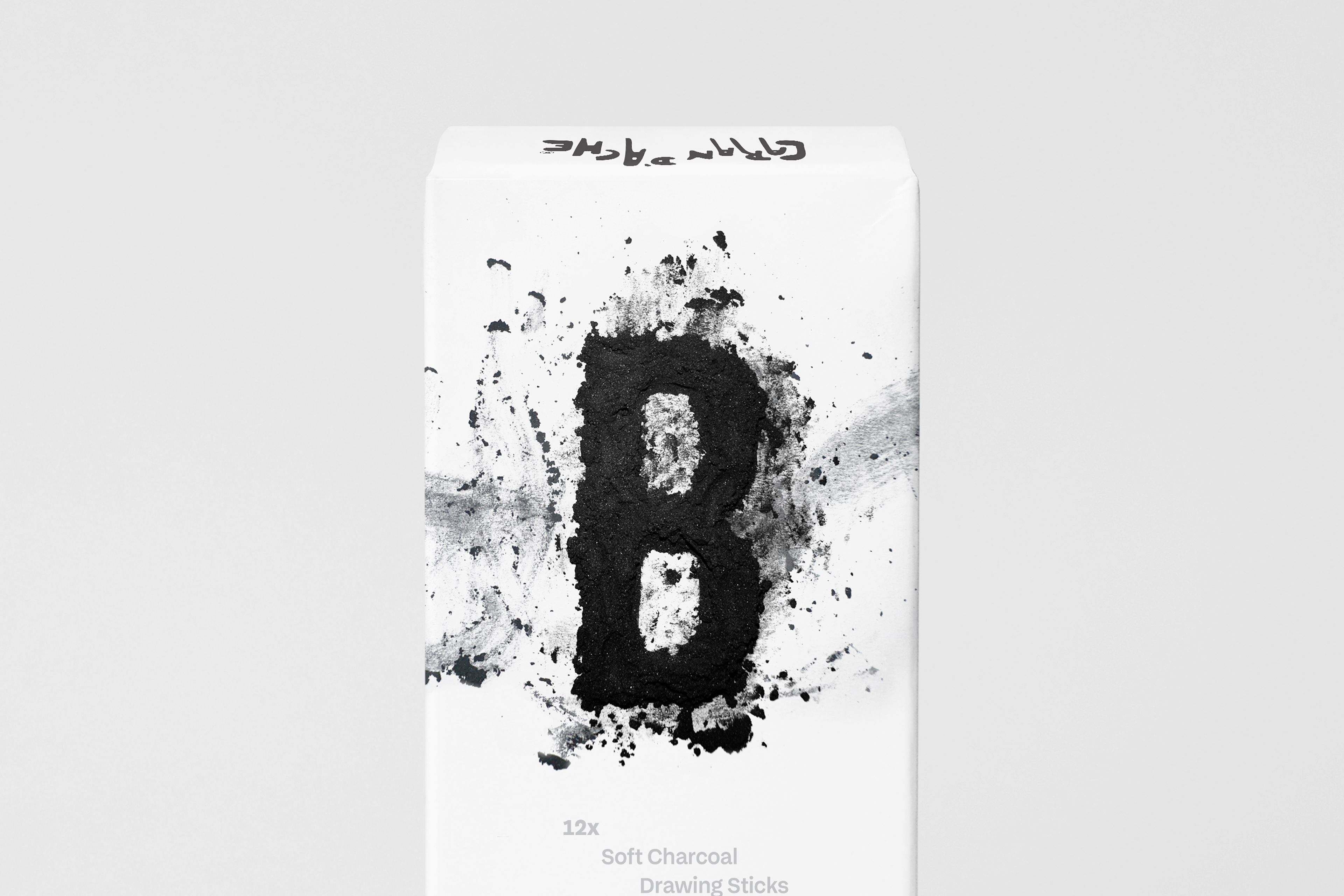
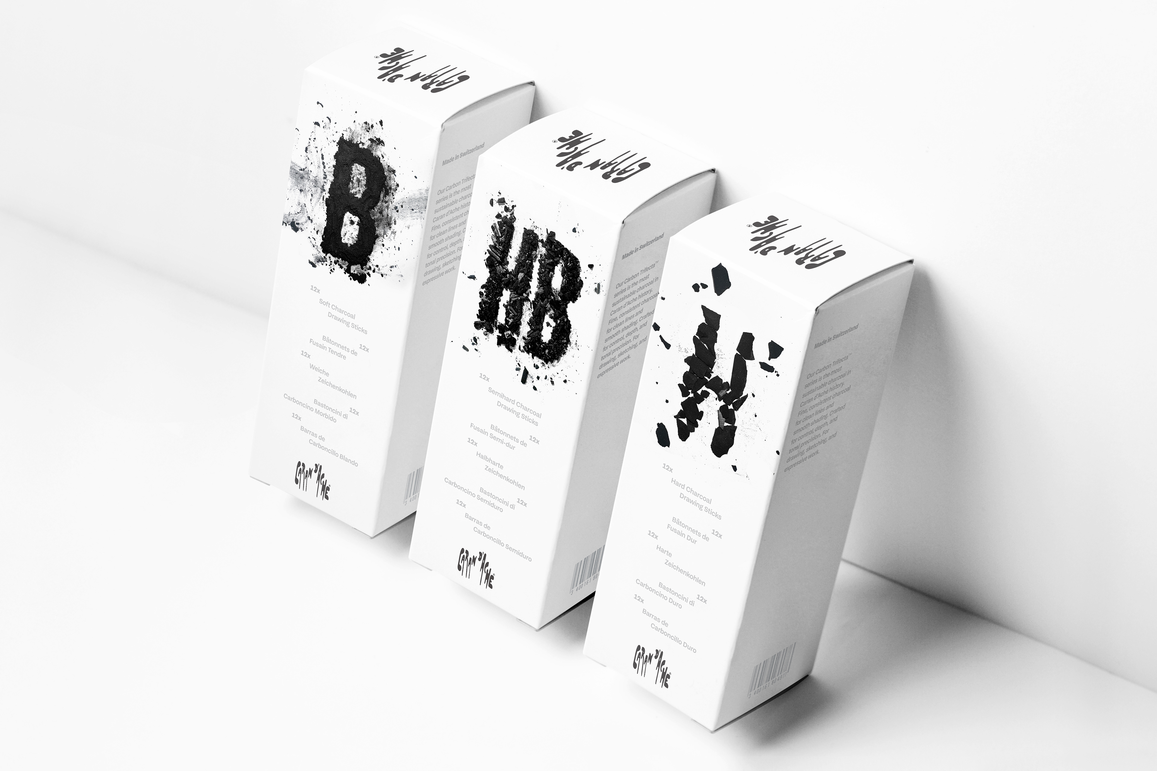
The construction of each analog letterform from various charcoal varieties naturally informed the outcome of their textural behaviors. Actual powdered charcoal, vine charcoal, and compressed charcoal were utilized.
Embracing the crushed charcoal's innate qualities by loosely coaxing the letterforms ensured authenticity, and lessened the risk of over-manipulating the medium and interfering with what makes each charcoal type unique.